Thinking about starting a podcast or looking to give your current show a visual refresh? Your podcast logos are super important. Seriously, they’re often the first thing someone sees when they’re scrolling through shows, and you want to grab their attention, right? A good logo can tell people what your show is about before they even hit play. It’s like a tiny billboard for your podcast. We’re going to break down what makes great podcast logos and give you some ideas to get yours looking sharp.
Alright, let’s talk about the elephant in the room: your podcast logo. You might be thinking, ‘It’s just a little picture, right?’ Wrong. So, so wrong. This tiny graphic is basically your podcast’s handshake, its first impression, and frankly, its ticket to not looking like it was designed in MS Paint by your Uncle Barry.
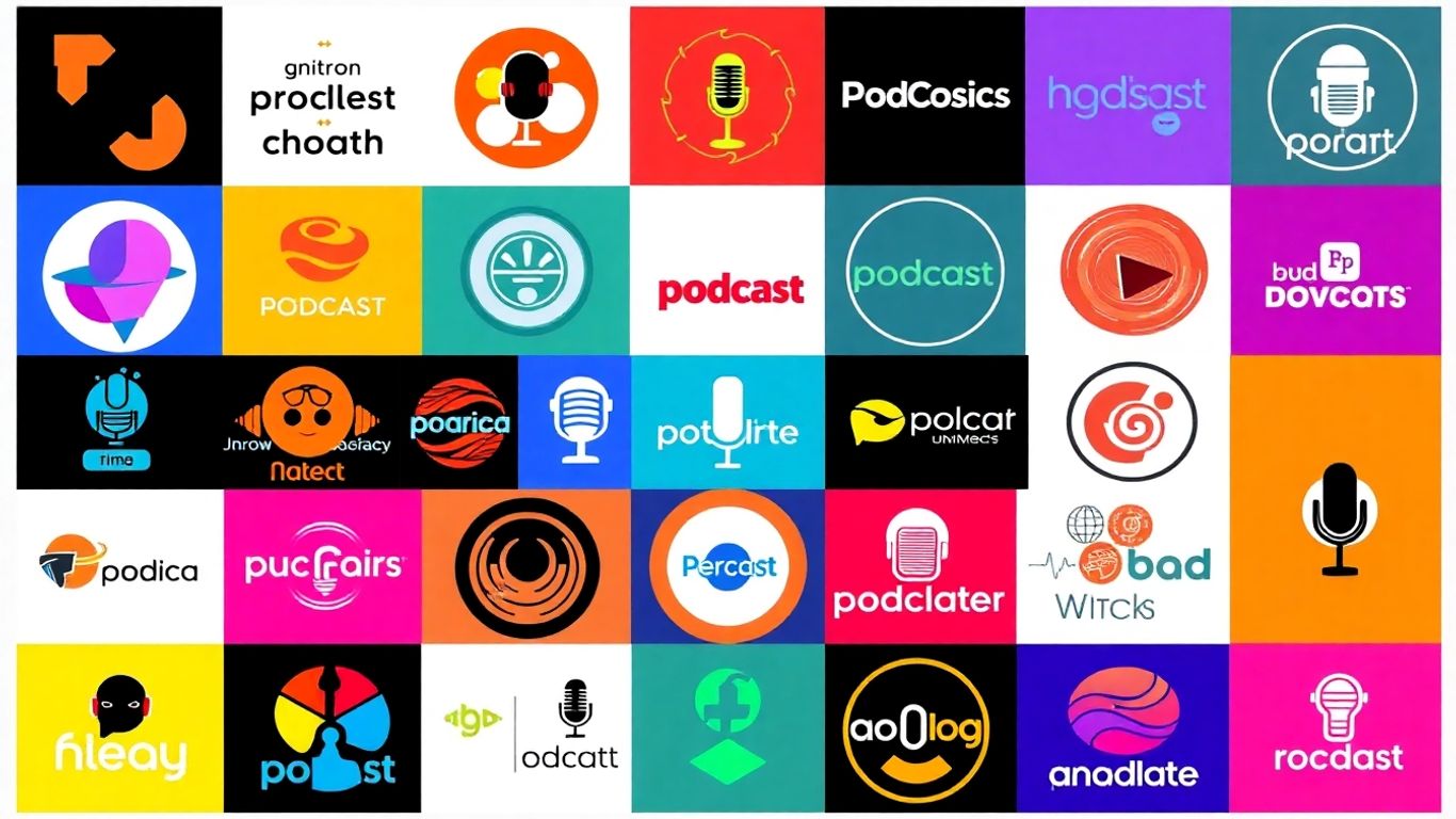
Think about it. When people are scrolling through endless podcast directories, what’s the first thing they see? Yep, that little square image. If your logo looks like a blurry potato, chances are people are just going to keep scrolling. It’s like showing up to a fancy party in sweatpants – it just doesn’t scream ‘listen to me!’ A good logo grabs attention, sparks curiosity, and makes someone think, ‘Hmm, this looks interesting.’ It’s your visual hook, and without it, you’re basically invisible.
Your podcast isn’t just a hobby; it’s a brand. And every great brand needs a solid visual identity. Your logo is the cornerstone of that identity. It’s what ties everything together, from your social media posts to your website, and even any cool merch you might dream up later. Consistent use of your logo across all platforms helps people recognize you instantly. It’s like a secret handshake for your listeners, making them feel part of something special. Building a strong brand starts with a memorable logo, and it’s a key part of essential branding tips.
Let’s be honest, a professional-looking logo signals that you’re serious about your podcast. It tells potential listeners that you’ve put thought and effort into your show. If your logo looks amateurish, people might assume your content is too. It’s a subtle psychological trick, but it works. A well-designed logo adds a layer of polish and professionalism that can make all the difference in convincing someone to hit that ‘play’ button. It’s the visual equivalent of wearing a suit to a job interview – it shows you mean business.
So, you’ve got this killer podcast idea, right? You’ve poured your heart and soul into the content, and now it’s time to slap a visual on it. But hold up, this isn’t just about slapping a picture on it. Your podcast logo is like the handshake you give before you even start talking. It’s the first impression, and let’s be honest, we all judge a book by its cover, or in this case, a podcast by its logo. Making it good is non-negotiable.
Look, nobody wants to squint at a tiny screen trying to figure out if that’s a squirrel or a very confused badger. Your logo needs to be clear and instantly recognizable, even when it’s shrunk down to the size of a postage stamp on someone’s phone. Think about it: if your logo looks like a Jackson Pollock painting exploded, people are just going to scroll past. Aim for clean lines and a design that screams
So, you’re thinking about what kind of logo to slap on your podcast. It’s not just a pretty picture, you know. It’s like the handshake your podcast gives to the world. You’ve got two main flavors to choose from: the logomark and the logotype. Or, you know, you can be a rebel and mix ’em up.
This is where you use a symbol, an icon, or even a graphic to represent your podcast. Think of the Nike swoosh – you see that, you know what’s up, even without the name. For your podcast, a good logomark is something memorable and unique that screams your show. It’s great because once people recognize it, they’ll spot your podcast anywhere, even if the text is tiny or in a different language. It’s all about that visual punch.
On the flip side, you’ve got the logotype. This is basically your podcast’s name, styled up all fancy. Think of Google or Coca-Cola. The font choice here is huge. Is your podcast serious and academic? Maybe a classic serif font. Is it a fun, chatty show? A more casual, sans-serif might do the trick. The right typeface can totally set the mood before someone even reads what your podcast is about. It’s all about making your name look good and feel right for your vibe.
Why pick just one when you can have your cake and eat it too? A hybrid logo combines a symbol with your podcast’s name. This is super common and often a really smart move. You get the visual recognition from the icon, plus the clarity of knowing exactly what the podcast is called. It’s like having your cake and eating it too, but for branding. You can even play around with having the icon and text separate sometimes, giving you more flexibility for different uses. It’s a win-win, really.
So, you’ve got this killer podcast idea, right? You’ve poured your heart and soul into crafting episodes, and now it’s time to give your show a face. But how do you make sure that face isn’t just another blob in the endless sea of podcast art? It’s all about making your logo memorable and, well, different.
Before you even think about colors or fonts, you gotta know who you’re talking to. Who are your ideal listeners? What are they into? What kind of vibe are they looking for? If your podcast is about vintage cars, a neon pink logo with glitter might not hit the mark. Think about what appeals to your target audience and what kind of visual language they understand. Also, take a peek at what everyone else in your niche is doing. You don’t want to accidentally copy someone, and you definitely want to figure out how to be the cool kid on the block, not the one blending into the wallpaper.
Your logo is like a tiny billboard for your podcast. It needs to scream (or whisper, depending on your style) what your show is all about. Is it a true crime podcast? Maybe some moody colors and a slightly unsettling font would work. Is it a comedy show? Go wild with bright colors and a playful design! The goal is to have your logo instantly communicate the essence of your content. It’s about capturing the feeling, the tone, and the subject matter in a single, neat package. Think of it as the visual equivalent of your podcast’s intro music – it sets the mood.
It’s tempting to jump on the latest design trends, but trust me, you’ll regret it later. That super-hip font or that specific color palette might look amazing today, but in a year or two, it could look as dated as dial-up internet. Instead, aim for a design that’s classic and enduring. Think about logos that have stood the test of time. They’re usually simple, clean, and focus on strong typography or a clear, iconic image. You want your logo to be recognizable for years to come, not just until the next design fad blows over. Building a strong podcast identity is important for listener recognition and loyalty, so a timeless logo is a great start. You can get some inspiration from popular podcast websites examples to see what works.
Here’s a quick rundown of what to keep in mind:
Remember, your logo is often the very first thing a potential listener sees. Make it count!
Alright, so you’ve got a killer podcast idea, maybe even a name that makes you chuckle. But before you start thinking about merch (hey, a podcaster can dream!), let’s talk about the actual look of your show. Your logo is like the handshake of your podcast – it’s the first thing people see, and you want it to be firm, friendly, and memorable. Let’s get this visual stuff sorted so your podcast doesn’t look like it was designed by a squirrel on a sugar rush.
Think about where people actually listen to podcasts. It’s usually on their phones, right? That means your logo needs to look good even when it’s tiny, like a postage stamp on a podcast app. If your logo is too complex, all those intricate details will just blur into a smudge. You want something that’s instantly recognizable, whether it’s displayed on a giant billboard (unlikely, but hey!) or as a tiny thumbnail. Keep it clean and bold, and test it out at different sizes. Seriously, shrink it down and see if you can still tell what it is. If it looks like a blob, it’s time to simplify.
Your logo isn’t just for your podcast app. You’ll want it on your website, your social media profiles, maybe even on a t-shirt if you get really popular. This means your logo needs to be adaptable. Can it work in black and white? Does it look good on different colored backgrounds? Can it be easily turned into a sticker or embroidered onto a hat? Think about how it will translate across various platforms. A good starting point is to have a primary logo and then maybe a simplified version or icon that can be used in smaller spaces. This flexibility is key to building a consistent brand identity, and you can find some great design examples to get your gears turning.
Okay, time for the slightly less glamorous, but super important, technical stuff. You’ll need your logo in a few different file formats to cover all your bases:
As for dimensions, a good starting point for cover art is often around 1400×1400 pixels or 3000×3000 pixels, usually in a square format. Always check the specific requirements of the platform you’re uploading to, but having a high-resolution master file is always a smart move. It’s better to have a file that’s too big and scale it down than to have one that’s too small and looks pixelated.
Making sure your logo is technically sound from the get-go saves you a massive headache down the line. It’s like prepping your ingredients before you start cooking – do it right, and the final dish will be so much better.
Alright, let’s talk about what makes a podcast logo actually work. Forget just slapping your podcast title on a colored background; we’re talking about visuals that grab people and say, ‘Hey, listen to this!’ Think of it like this: your logo is the handshake your podcast gives to the world. You want it to be firm, memorable, and maybe even a little intriguing. We’ve scoured the digital airwaves to find some gems that nail it, showing you how different genres and vibes get their own visual swagger. Get ready to see how the pros do it, and maybe get a few ‘aha!’ moments for your own masterpiece.
For podcasts diving into the murky depths of true crime, there’s a classic visual trick that just works. Think ransom notes, those old-school newspaper clippings with letters cut out and pasted together. It’s instantly recognizable and screams mystery, danger, and a bit of that ‘whodunit’ vibe. It’s a simple concept, but when done right, it perfectly captures the essence of a show that’s all about solving puzzles and uncovering dark secrets. It’s like the visual equivalent of a creaky floorboard in a haunted house – you know what you’re getting into, and it’s thrilling.
Podcasts tackling social justice issues often need logos that are clear, impactful, and speak volumes about their mission. We’re seeing a lot of bold typography, strong color contrasts (think black and white with a pop of something vibrant like neon pink or electric blue), and symbolic imagery. An equality symbol, like a bold equals sign, can be incredibly powerful. These designs aren’t just pretty pictures; they’re statements. They aim to convey a sense of fairness, urgency, and a call to action, making sure listeners know exactly what the podcast stands for before they even hit play. It’s about making a visual declaration of principles.
Now, if your podcast is all about helping folks drift off into dreamland, your logo needs to be the visual equivalent of a warm hug. Think soft colors, gentle curves, and imagery that evokes peace and tranquility. We’re talking muted blues, lavenders, or even soft grays. Maybe a subtle wave pattern, a crescent moon, or a simple, calming abstract shape. The goal here is to create a visual cue that immediately signals relaxation and safety. It’s about making your logo feel like the first step towards a good night’s sleep, a visual lullaby that promises calm. You want listeners to see it and feel their shoulders drop just a little bit. It’s a great way to build trust and set the mood for your calming audio content.
Here’s a quick look at how some different styles can convey a lot:
|
Podcast Niche |
Common Logo Elements |
|---|---|
| True Crime | Cut-out letters, distressed fonts, dark color palettes |
| Social Justice | Bold typography, high contrast, equality symbols |
| Sleep & Meditation | Soft colors, gentle shapes, abstract patterns |
Alright, so you’ve wrestled with fonts, colors, and whether a tiny picture of a donut really screams ‘true crime.’ Hopefully, you’ve walked away with some solid ideas for your podcast’s logo. Remember, it’s like giving your show a face – you want it to be friendly, maybe a little mysterious, but definitely not something that makes people want to change the station before they even hit play. Think of it as your podcast’s first handshake. Make it a good one, and who knows, maybe your show will be the next big thing. Now go forth and design something awesome, or at least something that doesn’t look like it was made in MS Paint circa 1998. Your listeners (and your ego) will thank you.
Think of your logo as the first handshake for your podcast. It’s the very first thing people see when they’re browsing for something new to listen to. A cool, clear logo can grab attention and make someone curious enough to check out your show. It also helps people remember your podcast and makes it look more professional, like you really care about what you’re doing.
A great logo is usually simple and easy to understand, even when it’s really small, like on a phone screen. It should also match the vibe of your podcast – if it’s a serious show, the logo should look serious; if it’s funny, it can be more playful. Using colors and fonts that fit your show’s topic and mood is also super important.
You have a few choices! You can use just a cool picture or symbol (that’s a logomark), or you can use just your podcast’s name in a stylish font (that’s a logotype). Many podcasts also combine both – a picture with the name. Think about what best represents your show and what will be easiest for people to recognize.
Your logo needs to look good on a tiny phone app icon, on your website, and maybe even on a t-shirt. This means it needs to be clear and readable no matter the size. Also, make sure you have the right file types, like PNGs with clear backgrounds, so it looks sharp on any background you put it on.
Colors can make people feel things! Think about the mood of your podcast. Blues and greens might feel calm, while reds and oranges can be energetic. For fonts, choose something that’s easy to read. A classic font might fit a history podcast, while a more modern or funky font could work for a comedy show.
Look at other podcasts you like, especially in your topic area. See what their logos are like and what makes them stand out. You can also check out design websites for ideas or even try using a free online logo maker to get started. The goal is to find something unique that tells people what your podcast is all about.
