Thinking about starting your own podcast or maybe just want to give your current show a fresh online look? You’ve come to the right place. Your podcast website is your show’s home on the internet, and getting it right can make a big difference in how people find and connect with your content. We’ve gathered some of the best examples out there to give you ideas on how to make yours stand out.
You know that feeling when you’re scrolling a science website, hoping for something more exciting than middle school biology class? Well, that’s where Huberman Lab, the podcast hub led by a real Stanford neuroscientist, flips things around. If you’re all about brain health or just want to learn why you suddenly can’t sleep after too much caffeine, this site has your back.
And while you’re binging sleep science or mental health tips, you’ll notice how everything feels connected right back to Dr. Huberman’s actual research and personal brand. It’s less of a stuffy lecture and more of a guided tour through your brain—by someone who knows their stuff.
Want to get the facts in half the time? Podcast summarizers can turn hour-long episodes into quick reads. They make it possible to squeeze in knowledge between, say, walking the dog and running for coffee. Check out how podcast summarizers can save you time by reading about their benefits.
Don’t be surprised if you leave with actionable health hacks… and maybe just a touch of newfound motivation to finally tackle those seven tabs open about meditation.
Alright, let’s talk about the Crime Junkie website. If you’re into true crime, you’ve probably stumbled upon this one. Ashley Flowers and Brit Prawat have built a serious empire with this podcast, and their website totally reflects that. It’s not just a place to find the latest episode; it’s like a whole hub for true crime nerds.
When you land on their site, it’s pretty straightforward. You get a clear look at the most recent episode, and scrolling down, you can easily find older ones. They’ve got this whole section inviting you to join their members-only club, which is a pretty smart move to get listeners more involved. It’s all about making it super easy for you to get your weekly dose of crime stories without any fuss.
Here’s what makes their site work so well:
The design is clean and functional, focusing on getting you to the content you want, fast. It’s a good example of how a podcast website can be both a listening post and a community builder.
Honestly, the Crime Junkie website nails the balance between being informative and engaging. It’s the kind of site that makes you want to stick around and explore, which is exactly what you want when you’re building your own podcast presence. You want people to find you, listen, and then maybe even buy a t-shirt. They’ve definitely figured that part out.
Alright, let’s talk about the website for 99% Invisible. If you’re into design, architecture, or just the stuff that makes the world tick in ways you never noticed, this is your jam. Roman Mars and his crew have built something pretty slick here, and honestly, it makes you feel like you’re getting the VIP treatment.
First off, you can actually listen to episodes right there on the site. No jumping through hoops, just hit play. They’ve also got this massive archive, so if you missed something or just want to go down a rabbit hole of design history, you’re covered. Plus, they throw in these in-depth blog posts that go way beyond just a quick summary. It’s like getting a bonus episode, but in text form.
What’s really cool is how they’ve organized everything. The menu bar is super straightforward. You’ve got links to:
This site is a masterclass in making a podcast website feel like an extension of the show itself. It’s clean, it’s informative, and it doesn’t try to be anything it’s not. It just presents awesome content in an awesome way. You can even download transcripts, which is a nice touch if you’re someone who likes to read along or refer back to specific points. It’s the kind of website that makes you think, ‘Yeah, these people really get it.’
Alright, let’s talk about the website for “Twenty Thousand Hertz.” If you’re into sounds, like, really into sounds, this is your jam. The site immediately slaps you with a vibrant hero section that basically says, “Hey, we’re all about the coolest sounds you’ve ever heard.” And honestly, it delivers. The host, Dallas Taylor, knows his stuff – he’s got years of experience in the digital sound world, even working with big names like Fox. So, when he talks about how sounds can make or break a brand, you listen.
What’s really neat is how they’ve organized everything. You can easily find and play episodes, figure out how to support the show (because, let’s be real, good podcasts deserve support), and get in touch. The episode descriptions are short and sweet, but they do a fantastic job of making you want to hit play. Seriously, they make you curious about the stories behind everyday noises.
And the archive page? Chef’s kiss. It’s laid out super clean, in three columns, showing episodes from newest to oldest. But here’s the kicker: you can actually search and filter episodes by year, topic, or even by the emotion they evoke. How cool is that? It’s like a sonic mood board. They even have a press section with logos of places that have featured them, which is a smart move to build trust. It’s a bright, clever, and super easy-to-use site that really makes you appreciate the world of sound.
Okay, so you’re looking to get your daily dose of news without, you know, actually watching the news? “The Newsworthy” podcast has got your back. Their website totally gets it. It’s super clean, uses a good amount of white space, which is nice because who needs more clutter in their life?
The hero section is dedicated to the latest episode, which is a smart move. It means you can jump right in without hunting around. Plus, they sprinkle in listener reviews, which is a solid way to build trust. It’s like, “Hey, other people like this, so you probably will too!”
Their site is built on Squarespace, and it shows. It’s easy to use, looks good on your phone, and doesn’t try to do too much. You can tell they put thought into making it simple to listen or subscribe. It’s a great example of a news podcast website that actually works for the listener, not against them. If you’re curious about how to make a news-focused site look good, you might want to check out some other news website designs for inspiration.
Alright, let’s talk about the Joe Rogan Experience website. If you’ve ever stumbled upon it, you’ll notice it’s not exactly reinventing the wheel, and honestly, that’s kind of its charm. Built on Squarespace, it keeps things super straightforward. You land there, and it’s like, ‘Here’s the podcast, here’s where to buy stuff, and here’s how to find him elsewhere.’
What’s cool is that it consolidates everything onto one single, easy-to-digest page. No endless clicking around trying to find the latest episode or a link to Spotify. It’s all right there. You can jump straight to listening on your preferred platform or snag some of that coveted merch. It’s a no-frills approach that totally works for a show of this magnitude.
The site’s simplicity is its superpower. It respects your time and gets you straight to the good stuff: the podcast itself, or maybe a new t-shirt.
It’s a solid example of how a podcast website doesn’t need to be overly complicated to be effective. You get the essential info, direct links, and a clear path to supporting the show, whether that’s through listening or buying.
Here’s the lowdown:
Alright, let’s talk about Duncan Trussell’s website. If you’ve ever listened to his podcast, you know it’s a wild ride through spirituality, consciousness, and all the wonderfully weird bits of life. His website? It totally gets that vibe. Think loud, playful, and bursting with personality.
Right off the bat, you’re hit with vibrant purple, some psychedelic backgrounds, and a logo that’s all caps and totally owns it. It immediately tells you what you’re in for. The homepage is all about the latest episode, usually featuring some cool guest artwork, a little bio, who’s sponsoring the show, and, of course, an embedded player so you can start listening right away.
Finding your way around is pretty straightforward. You’ve got clear links to all the important stuff: social media, RSS feeds, iTunes, Patreon, and how to get in touch. They even weave in tour dates pretty smoothly, with those handy ‘Tickets’ buttons always visible.
What’s cool is how they balance the fun with clarity. Big titles, illustrated icons, and lively headlines guide you through the site without making your brain melt. It’s a fantastic example of a website that feels as energetic and alive as the podcast itself. It’s a digital space that truly reflects the show’s unique spirit.
Alright, let’s talk about ‘The Friday Habit.’ Ever feel like your business is just chugging along, but you’re not really growing it? These folks have a whole system built around dedicating Fridays to, you guessed it, habit-building for business growth. Pretty neat, huh?
Their website, built by co-host Benjamin Manley’s Squarespace agency, Knapsack Creative, and with copy from Mark Labriola II’s Brand Viva Media, is a prime example of how to do this right. It’s got this warm, optimistic vibe, thanks to bold yellow colors and some subtle illustrations. You land on the page, and bam! There’s a confused-looking business person who’s just discovered the podcast, with a big arrow pointing you to the ‘Listen to the Podcast’ button. Talk about a clear call to action.
The layout is super clean and focuses right on the episodes, making it a breeze to just jump in and listen. It flows like a well-oiled landing page, taking you from the problems you might be facing to the tools and solutions, even throwing in some testimonials and more calls to action. And get this, they’ve got a lead magnet – a guide called ‘5 Habits’ – placed perfectly to snag your email address. Smart.
They make it incredibly easy to find the podcast on all the major platforms like Apple, Google, Spotify, and YouTube. No hunting around required.
Seriously, if you’re looking for a website that feels both super helpful and totally professional, you’ll want to check out what ‘The Friday Habit’ has done. It’s a solid blueprint for making your podcast site work for you.
Alright, let’s talk about The Collective Podcast’s website. If you’re aiming for a clean, no-fuss look, this is a great place to start. They’ve gone with a minimalist grid layout that’s super easy on the eyes. You get your podcast thumbnails, titles, and just a little snippet of what each episode is about. It’s like a well-organized digital magazine rack, but for your ears.
What I really dig is how they kept the header and footer super simple, sticking to a light background. It makes everything feel really open and airy, letting the episodes themselves be the main focus. No distracting clutter here, folks!
And get this, right there in the navbar, you’ve got links for social media, email, and of course, where to listen to the podcast. Plus, a search bar and even a shopping cart – handy if they’re selling some cool merch. It’s a masterclass in keeping things simple yet functional.
Here’s the lowdown on what makes it work:
They built this gem using Squarespace, which, let’s be honest, is a pretty popular choice for a reason. It lets you get a professional-looking site up without needing a degree in web design. If you want your podcast website to feel organized and straightforward, take some notes from The Collective Podcast. It’s all about making it easy for people to find and listen to your show, and they nailed it.
Alright, let’s talk about the website for “Congratulations With Chris D’Elia.” If you’re a fan of Chris’s particular brand of humor – you know, the kind that’s a little off-the-wall and definitely spontaneous – then his website is probably going to feel like home. It’s built on Squarespace, which is a solid choice for keeping things looking sharp without needing a degree in web design.
What really grabs you when you land on the page is the embedded playlist right there, front and center. No hunting around for the latest episode; it’s ready to go. And if you’re more of an Apple Podcasts person, they’ve got a clear call-to-action button for that too. It’s all about making it super easy for you to get your dose of D’Elia.
The site really leans into Chris’s persona. Think bold colors, maybe a cartoon illustration of him looking a bit wild – it’s designed to match the energy of the podcast itself. It’s not trying to be some super serious news site; it’s here to make you laugh and listen.
They also do a pretty good job of promoting their Patreon. You’ll likely see a bright, attention-grabbing notification bar at the top, usually on a contrasting background, basically yelling, “Hey, join our community!” It’s a smart move to get fans involved and support the show. You can find all sorts of different topics and episodes that make you laugh, like getting into fights with Mark Wahlberg, on his podcast.
So, if you’re looking for a website that’s as direct and fun as the podcast itself, “Congratulations” nails it. It’s got the tunes ready, clear ways to listen, and a personality that matches the host. Pretty neat, huh?
Alright, let’s talk about the website for “How Did This Get Made?” If you’re a fan of truly terrible movies and the hilarious dissection of them, you’ve probably stumbled upon this gem. Their website totally gets the vibe of the show – it’s a bit chaotic, a lot of fun, and surprisingly well-organized for a place dedicated to dissecting cinematic disasters.
When you land on their page, you’re hit with a design that’s both bold and kinda slick. Think dark backgrounds with pops of electric green and these cool, soft blue circles. It’s not just for looks, though; the text is easy to read, even with all the different font weights they use. Plus, the way the pages shift and elements hover? It adds a little something extra without being distracting. It’s like they took the spirit of watching a hilariously bad movie with friends and put it online.
What’s great is how they make it super easy to find what you’re looking for. You can jump right to the latest episodes, check out their merch (because, let’s be honest, you probably want a shirt that says something ridiculous from an episode), or even find out where to listen. They’ve managed to pack a lot of info without making it feel cluttered. It’s a masterclass in balancing fun with function.
You know how sometimes you watch a movie and just think, ‘How did this even get made?’ This website is the digital home for people who ask that question about films, and it does a fantastic job of capturing that energy. It’s a place where bad movie lovers can unite and find all the info they need.
Here’s what really makes their site work:
Honestly, if you’re looking for inspiration on how to build a website that perfectly matches your podcast’s personality, especially if that personality is a bit weird and wonderful, you should definitely check out what “How Did This Get Made?” has done. It’s proof that you don’t need to be super serious to have a super effective online presence.
Alright, let’s talk about Emma Gannon’s website. If you’re looking for a podcast site that feels like a warm hug from a friend, this is it. It’s got this really inviting vibe, thanks to some colorful images and just generally good communication. You land on the page, and bam, you know exactly what you’re getting into and who’s behind it all.
What I really dig is the first-person intro and that direct-gaze portrait. It makes you feel like Emma’s right there chatting with you, not just some distant voice. The visuals are pretty unique too, with soft, vibrant colors that totally capture her personality. It’s not just a bland list of episodes; it’s got character.
And the navigation? Super smooth, whether you’re on your phone or your computer. It’s easy to find new stuff without getting lost in a maze of menus. It’s a great example of how a podcast website can be both functional and a reflection of the host’s unique style. If you’re thinking about your own podcast site, consider how you can inject your personality into the design. You might even find inspiration from how other creators share their stories, like those on The One You Feed.
Alright, let’s talk about The WPMRR Podcast website. If you’re looking for a site that just works and makes it super easy to get your podcast fix, this is a good one to check out. Built on WordPress, it’s got this clean, consistent branding that feels really put-together. You know, not all over the place like my attempt at assembling IKEA furniture.
What I really dig is how they’ve used widgets to make sure you can find their episodes no matter where you hang out online. It’s like they’ve thought of everything. You want to listen on Spotify? Got it. Apple Podcasts? Yep. They’ve made the paths to listening and subscribing super clear, which, let’s be honest, is half the battle with any podcast.
They’ve managed to integrate their podcast content across different platforms without making the site feel cluttered. It’s a neat trick, and they pull it off.
Seriously, the way they present their episodes is straightforward. You can jump right in and start listening without a whole song and dance. It’s a solid example of a podcast website that prioritizes the listener experience. If you’re curious about how to make your own podcast website shine, taking a peek at how they handle things, especially their web hosting review content, could give you some great ideas. They’ve nailed the user-friendliness, which is always a win in my book.
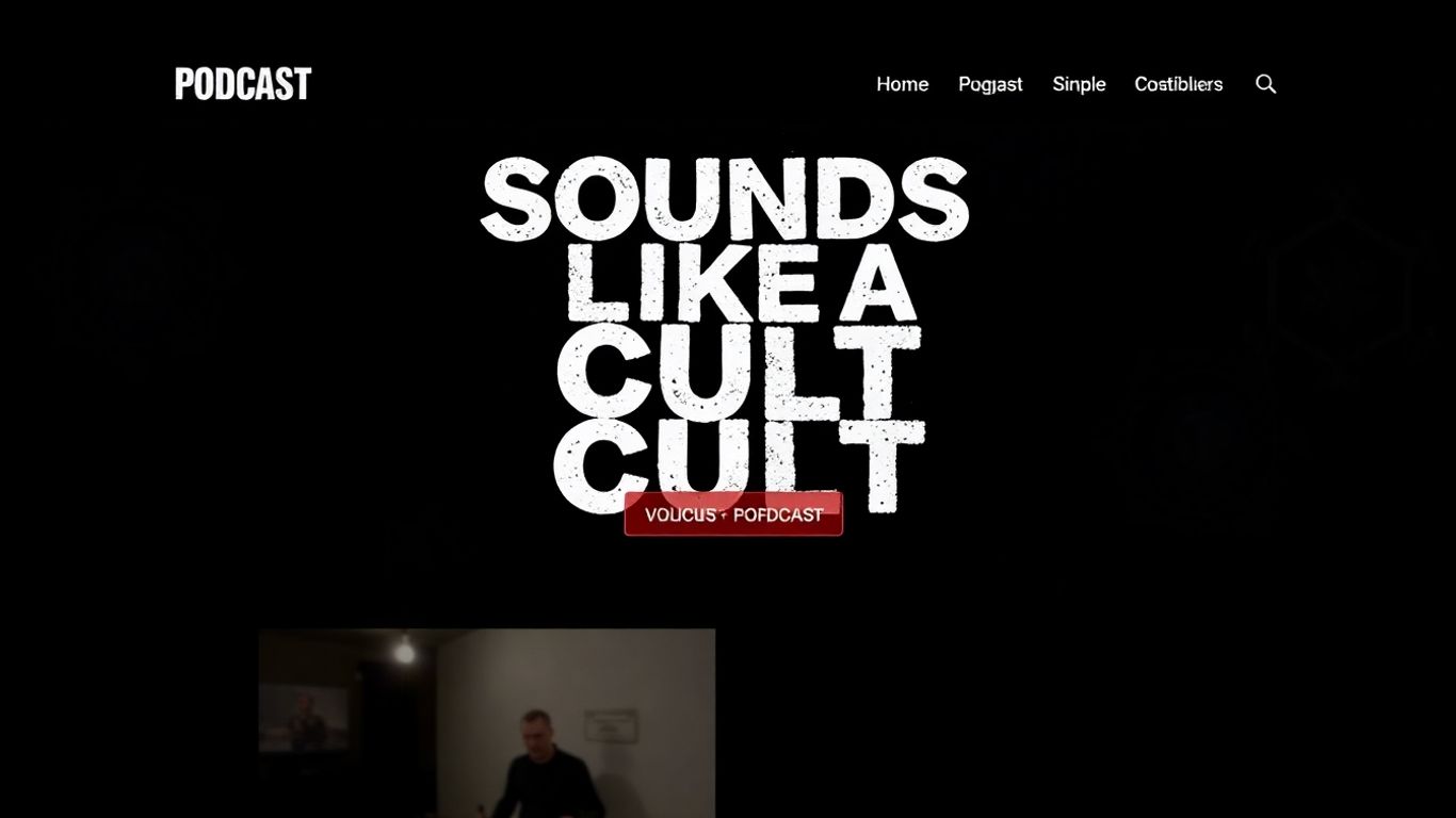
Right when you land on the “Sounds Like a Cult” website, you’re hit with a burst of color and quirky personality. The homepage serves up a flashy hero image that basically screams, “Hey, this isn’t your standard, boring listen!”
The vibe is clear: fun, irreverent, and a little bit mysterious—just like the podcast itself.
Here are a few things you’ll notice right away:
The layout won’t make you feel like you’re caught in a rabbit hole. Bright banners and chunky buttons make finding recent episodes or show info stupid-easy. And if you care about web stuff, yeah, it loads fast and works on your phone, too.
If you want a podcast website that feels alive and never takes itself too seriously, this is the kind of setup you should check out. It’s like a cult, but nobody will ever make you wear matching tracksuits (hopefully).
Let’s be honest—most podcast websites could take a cue here. Loud, clear, and actually fun: that’s the cult difference.
Alright, let’s talk about the “Transition of Style” podcast website. If you’re into fashion, especially the queer fashion scene, this is your jam. The website itself is super clean, which is a nice change of pace from some of the more cluttered sites out there. You can easily find the latest episodes, and get this – each episode comes with a full transcript. How handy is that?
They’ve got this whole section about the show’s mission, which is pretty cool. It gives you a good feel for what they’re all about before you even hit play. Plus, the site is easy to get around, which, let’s be honest, is half the battle these days. You’ll find links to all the usual podcast spots and social media, so you can follow along wherever you hang out online.
The site really nails showcasing the show’s vibe without being over the top. It’s a great example of how a podcast website can be both informative and stylish, much like the fashion industry it covers. It makes you want to explore, listen, and maybe even rethink your own wardrobe. If you’re looking to build a site that’s both functional and reflects your podcast’s personality, you could do a lot worse than taking a peek at this one. It’s a solid place to start your own podcast website design journey.
Okay, let’s talk about ‘Normal Gossip.’ If you’re someone who secretly (or not so secretly) loves a good juicy story, this podcast is basically your digital water cooler. Hosted by Kelsey McKinney and Alex Sujong Laughlin, they take listener-submitted gossip, strip out all the identifying details, and then have a field day dissecting the weird, the wild, and the downright hilarious.
Their website isn’t a standalone thing; instead, it lives on Defector.com, which is kind of cool. It means you get a little taste of that Defector vibe while still finding all the essential podcast info. You’ll find a quick rundown of what the show is all about, plus all the usual links to wherever you get your podcast fix. They even include a phone number and email if you’ve got some gossip of your own to share – how fun is that?
What makes ‘Normal Gossip’ so great is how relatable it is. We’ve all been there, right? Overhearing something, seeing something, wondering what’s really going on. This podcast taps into that universal curiosity. It’s like getting a peek behind the curtain of everyday life, but with a fun, chatty spin.
Here’s what you can expect when you tune in:
The beauty of ‘Normal Gossip’ is its ability to turn the mundane into something fascinating. It’s a testament to the fact that interesting stories are everywhere, you just have to know where to look – or, in this case, where to listen.
If you’re looking for a podcast that’s lighthearted, engaging, and just plain entertaining, you’ve got to check out Normal Gossip. It’s the perfect listen for when you need a break from the serious stuff and just want to get lost in some good old-fashioned storytelling.
Alright, let’s talk about “Happier.” You know, the podcast from Gretchen Rubin, the lady who wrote “The Happiness Project”? Yeah, that one. She teams up with her sister, Emily Craft, and together they basically try to sprinkle a little more joy into your life. Think of it as your weekly dose of self-care and wellness tips, all wrapped up in a friendly chat.
Their website is pretty much what you’d expect – it’s part of Gretchen Rubin’s whole online world. You’ll find a search bar to dig through episodes, a quick rundown of what the show is all about, and, of course, links to buy their books and some cool merch. It’s all very organized, making it easy to find what you’re looking for, whether it’s a specific episode or just a way to support the show.
It’s a good reminder that even something as simple as a podcast website can be a whole ecosystem. You’ve got the episodes, the books, the merch – it all ties together.
This podcast is a great example of how a personal brand can extend into a successful podcast. It feels like you’re just hanging out with friends, getting advice that actually feels doable.
So, if you’re looking to boost your own happiness, or just want some lighthearted listening, you know where to find them. It’s a solid place to start if you’re curious about personal growth strategies.
Okay, so American Girl, the brand that probably gave you your first taste of historical fiction and maybe a few questionable hairstyles, decided to hop on the podcast train. And honestly? They didn’t just dip a toe in; they built a whole darn network. It’s kind of wild to think about, right? One minute you’re collecting dolls, the next you’re listening to their podcast network.
Their website is pretty straightforward, which is actually a good thing. You’ve got your ‘About’ page, which is, you know, about stuff. Then, below that, you’ll find links to all the different podcasts they’ve cooked up. Think chat shows, fan club goodies, and even little mystery stories for the kiddos. It’s a fun little content marketing play, and you have to admit, it’s pretty clever.
When you click on ‘Listen Now’ for any of their shows, a little pop-up appears. It’s like a treasure chest of links, pointing you to all the usual places where you can stream the audio.
The whole setup feels very much like an extension of the brand itself – accessible, a little bit nostalgic, and aimed squarely at their audience. It’s not trying to be some super edgy, avant-garde podcast network; it’s just… American Girl. And that’s perfectly fine.
So, if you’re feeling a bit nostalgic or just curious about what a doll company’s podcast network sounds like, give it a whirl. You might be surprised by what you find. It’s a solid example of a brand extending its reach into audio content without losing its identity.
Alright, let’s talk about the “Bullseye” website. Hosted by Jesse Thorn, this podcast dives deep into the world of arts and culture, chatting with all sorts of creators. Now, you might think a show like this would have a super flashy website, but “Bullseye” keeps it pretty chill. Since it’s part of the Maximum Fun network, its website lives under their umbrella.
Think of it as the minimalist cousin in the family. You won’t find a ton of bells and whistles here. Instead, you get straightforward tabs for what you actually need: episode transcripts, how to get in touch, and maybe some extra podcast goodies. It’s all about getting you to the content without any fuss.
Here’s what you can expect:
They also make it super easy to find the podcast on all the usual spots – Apple Podcasts, Spotify, you name it. Plus, if you’re looking to snag some merch, they’ve got a link for that too. It’s a solid example of a network-affiliated podcast site that prioritizes clarity and function over a whole lot of visual noise. It’s proof that sometimes, less really is more.
Alright, let’s talk about Nocturne. If you’re into podcasts that feel like a late-night drive with the windows down, this one’s for you. Hosted by Vanessa Lowe, Nocturne is all about that nighttime vibe – you know, the dreamy, spooky, and sometimes just plain weird feelings that creep in after dark. It’s not just a podcast; it’s like a whole mood, blending stories, soundscapes, and a touch of the uncanny.
The website itself is pretty slick. When you land on the homepage, you’re greeted with this cool illustration of a possum chilling on a rooftop, overlooking the city at night. It immediately sets the tone. You’ll find all the usual suspects here: links to wherever you usually get your podcasts (Spotify, Apple Podcasts, you name it), their social media spots, a quick rundown of what the show is about, and, thankfully, an embedded audio player so you can jump right into the latest episode without a fuss. It’s a website that understands its audience – people who appreciate the quiet hum of the world after midnight.
What makes Nocturne stand out is how it uses its website to mirror the podcast’s atmosphere. It’s not just functional; it’s atmospheric. You get a sense of the show’s personality before you even hit play. It’s a good reminder that your podcast website isn’t just a place to list episodes; it’s another chance to draw people into your world. Think of it as the digital equivalent of a dimly lit room with a good story brewing.
Alright, let’s talk about the Future Ecologies website. If you’re someone who enjoys the great outdoors or just likes to ponder how we humans interact with the planet, this is your jam. Their website does a pretty slick job of showing off their cool podcast thumbnails, which, let’s be honest, are a nice touch. It covers all the usual bases you’d expect from a podcast site, too.
You’ll find the latest episodes front and center, a clear explanation of what the podcast is all about, and some contact info if you’re feeling chatty. Plus, they’ve got this super user-friendly podcast player right there, so you can jump into an episode without any fuss. What’s really neat, though, is that they also offer album downloads for the original music Mendel Skulski and Adam Huggins whipped up for the show. Pretty cool, right?
The site really nails the balance between showcasing their unique artistic elements and providing all the practical info you need. It’s a good reminder that your podcast website doesn’t have to be boring to be functional.
Here’s what makes it work:
This approach shows you can have a website that’s both visually appealing and incredibly practical. It’s all about making it easy for your audience to connect with your content and feel like they’re getting a complete experience.
Alright, let’s talk about the Teddi Tea Pod website. If you’re looking for a site that screams ‘celebrity adjacent’ and knows how to blend a podcast with a whole business empire, this is your jam. It’s built on WordPress, which gives it a lot of flexibility, and you can tell they’ve used that to their advantage.
Right off the bat, the homepage is all about Teddi Mellencamp (yes, that Teddi). Her credentials and personality are front and center, which is smart. It builds trust and makes you feel like you’re getting advice from someone who actually knows their stuff, even if it’s about entertainment gossip or accountability coaching. This is a masterclass in personal branding.
What’s cool is how they’ve woven the podcast into everything else. You’ve got your episode library, easy to find and play, but then you also see clear calls to action for her coaching services and any products she’s pushing. It’s like, ‘Listen to the podcast, then sign up for my life-changing program!’ It’s a pretty effective way to monetize beyond just ad revenue.
Here’s a quick rundown of what makes it work:
You can really see how a podcast can be just one piece of a larger puzzle. This site doesn’t just host a podcast; it’s a hub for Teddi’s entire brand. It shows you how to connect with your audience on multiple levels, not just through audio.
If you’re thinking about how to make your podcast website work harder for your business, you should definitely check out some of the best podcast websites of 2026 for inspiration. The Teddi Tea Pod site is a prime example of how to do it right, especially if you’ve got other ventures you want to promote alongside your show. It’s a solid blueprint for anyone looking to grow their audience and their business simultaneously.
So, you’ve got a podcast about, well, something super specific? Like, the history of sporks or the mating rituals of garden gnomes? That’s where Niche POD comes in. This website is like a breath of fresh air if you’re tired of the same old flashy designs. It’s all about keeping things clean and letting your unique content shine.
Think minimalist grid layouts. You’ll see episode thumbnails, dates, and titles, but no overwhelming excerpts. It’s like a well-organized bookshelf for your niche obsessions. The whole vibe is super clean, with a transparent sticky header that has a handy hamburger menu. And the footer? It’s just as simple, with social icons and links to where people can actually listen.
The key takeaway here is that a minimalist design with plenty of white space can actually make your content stand out even more. It’s a smart move if your podcast isn’t about mainstream topics. You want your listeners to focus on what you’re saying, not get distracted by a chaotic website. It’s proof that you don’t need a million bells and whistles to have an effective podcast site. Sometimes, less is definitely more, especially when you’re diving deep into the wonderfully weird corners of the internet.
Alright, let’s talk about the SERP’s Up podcast website. Built on Wix, it’s got this super clean, minimalist vibe going on. You land on the page, and BAM! The latest episode is right there, front and center, ready for you to hit play. No messing around, just pure podcast goodness.
They’ve got this cool two-column blog setup where you can dig into other episodes. And if you’re the type who likes things delivered straight to your inbox (who isn’t?), there’s a spot to sign up so new episodes land right in your email. It’s a smart move, really. It’s all about making it easy for people to listen and stay connected.
What’s neat is how they keep things simple but effective. You don’t get bogged down with a million flashy things. It’s just a straightforward, user-friendly experience that gets you listening to the podcast without any fuss. It’s a good example of how a minimalist design can actually be more engaging because it focuses on what matters: the content.
Think about it:
It’s like a well-organized digital living room for the podcast. You walk in, the show’s on, and you can easily find what you’re looking for. Pretty slick, right?
Alright, let’s talk about the Construction Disruption Podcast. If you’re in the construction game, or even just curious about how things get built (and sometimes, how they get disrupted), this is a site you’ll want to bookmark. It’s not just about dusty hard hats and blueprints, though. They’re actually talking about some pretty forward-thinking stuff, like how AI is shaking things up on platforms like LinkedIn. Seriously, who knew construction and AI would be best buds?
You can find all the latest episodes right there, and they make it super easy to figure out what’s going on. They’ve got a clean layout that doesn’t make you feel like you’re trying to assemble IKEA furniture without instructions. Plus, they’ve got links to all the usual spots – subscribe here, follow us there, buy our merch (because, let’s be honest, who doesn’t love a good podcast t-shirt?).
What’s cool is how they weave in topics that might seem a bit out there for construction, but honestly, it makes total sense. Think about it: every industry is changing, and construction is no different. They’re not afraid to get into the weeds about how technology is impacting the field, which is pretty neat. You can even check out some of the press mentions they’ve snagged, which is always a good sign that you’re listening to something legit.
If you’re looking to stay ahead of the curve in the construction world, or just want to hear some interesting takes on business and tech, give Construction Disruption a look. It’s a solid example of a podcast website that’s both informative and easy to use, proving you don’t need a degree in web design to make something that works.
Looking for a good laugh and some smart takes on life? Check out the “Construction Disruption Podcast” for a fresh blend of humor and real talk. It’s a great way to get your daily dose of fun and insight. Don’t miss out – visit our website today to dive into the latest episodes and discover more!
Alright, you’ve seen some seriously cool podcast websites, right? It’s like window shopping for your own online digs. Don’t get overwhelmed, though. Think of these examples as your cheat sheet. You don’t need to copy them exactly, just grab the bits that make you go ‘Ooh, I like that!’ Whether it’s a slick player, a super-easy way to find old episodes, or just a design that screams ‘you,’ the goal is to make your podcast home base awesome. Now go forth and build something listeners will actually want to hang out on!
Think of your podcast website as your show’s main hangout spot online. It’s where listeners can easily find all your episodes, learn more about you and your show, and connect with your brand. It helps people find you through search engines and makes your podcast look more professional. Plus, it opens up ways to make money, like selling stuff or offering special content, and helps you build an email list of fans.
Make sure your website has a clear way for people to listen to or download episodes, like an audio player. It’s also super helpful to have a list of all your past episodes, maybe even with a search bar. Adding buttons so people can subscribe on their favorite apps (like Apple Podcasts or Spotify) is a must. Showing off any reviews or mentions can also help build trust.
Many podcasters use website builders like Squarespace or WordPress because they’re user-friendly and can help with things like hosting your podcast’s information feed. Some platforms are made just for podcasters and come with features like built-in audio players and easy ways to add episodes, which can save you a lot of time.
Absolutely! Your website can be a great tool for making money. You could sell merchandise, offer exclusive content or bonus episodes to paying subscribers, accept donations from listeners who love your show, or partner with sponsors for ads.
A website makes it easier for new people to discover your podcast. When people search online for topics you cover, your website can show up in the results. It also gives you a central place to share links to your show on social media and in your episode descriptions, making it simple for anyone to find and listen.
Great podcast websites often have a clean and attractive design that matches the show’s vibe. They make it super easy for visitors to find what they’re looking for, whether it’s the latest episode or older ones. Having clear calls to action, like buttons to subscribe or listen, and unique visuals or branding can also make your site memorable.
